How to Choose the Best Creatives for Your Offers: Successful Campaign Tips!
What are creatives, why are they important and how to choose the most suitable ones?
Specifics for ad formats and verticals.
WHAT ARE CREATIVES
In the online advertisement word “creatives” can relate to many things. They are often used
to
define ad materials. It can be push notification, banner, native ad or video ad. Even
your offer
itself can be called a creative (ex. your prelander or landing page)! So, basically these
are
all visuals that help in promoting your campaign.
One user can see millions of ads everyday: on the phone or PC, billboards on the street and
pop-ups online and many more. All of them have one purpose - to catch potential client’s
attention. It is not easy to be remembered in a modern advertising world and creatives are
the
key to it.
Choosing the right creatives directly affects your campaign’s performance. Here we’ll talk
about
how to choose the best ad materials for your offers and thus reach maximum profitability.
CREATIVE STRUCTURE
Creative contents can vary depending on what ad campaign you are launching. For sure, push
notifications and banner ads would have different elements.
- Promo text;
- Main picture;
- Icon image;
- Call to action.
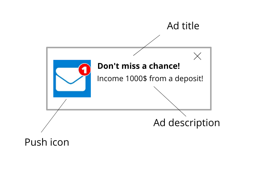
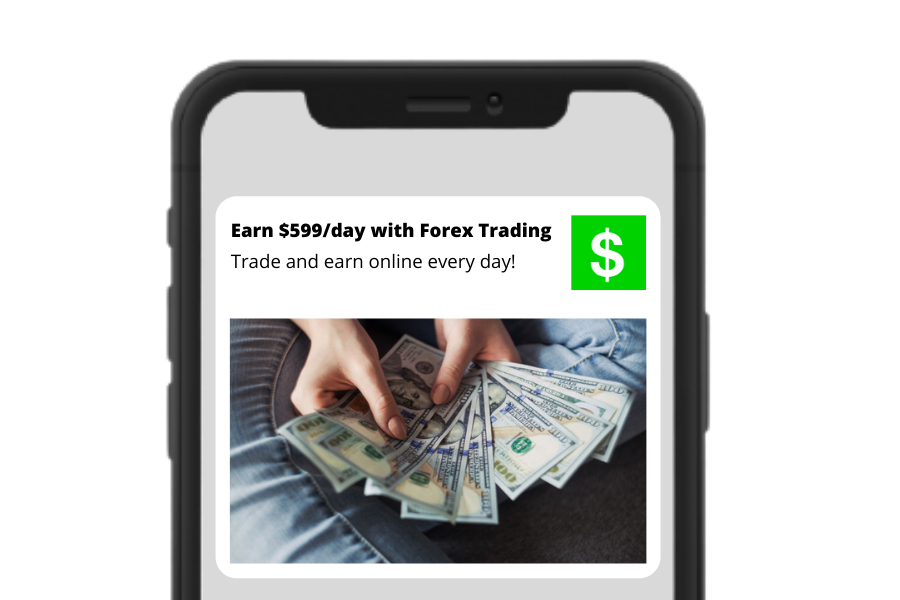
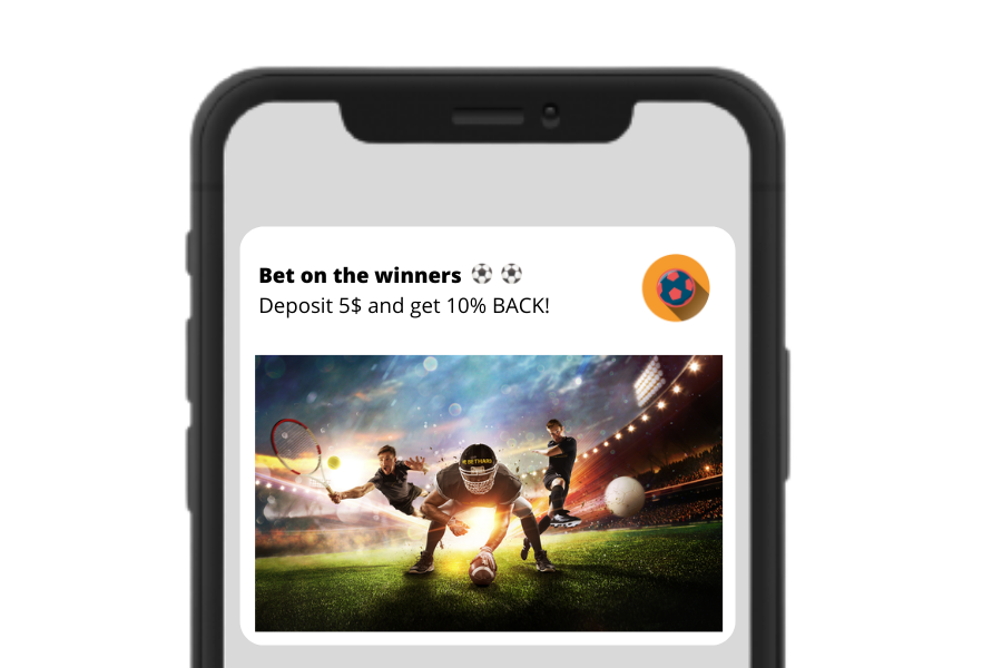
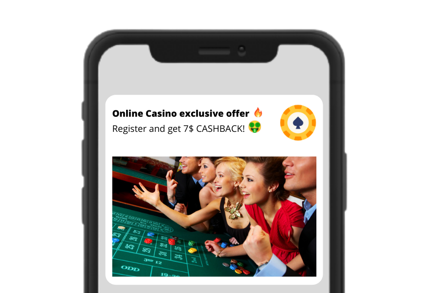
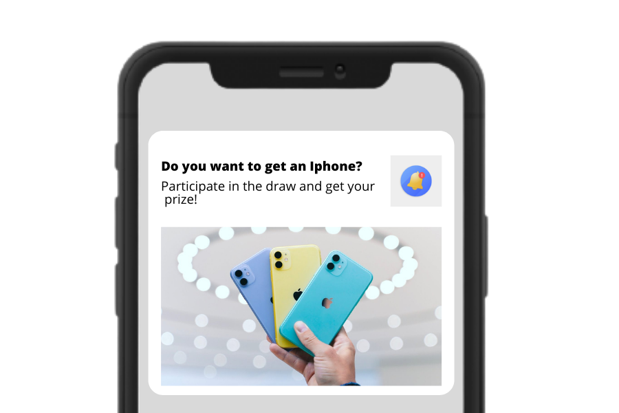
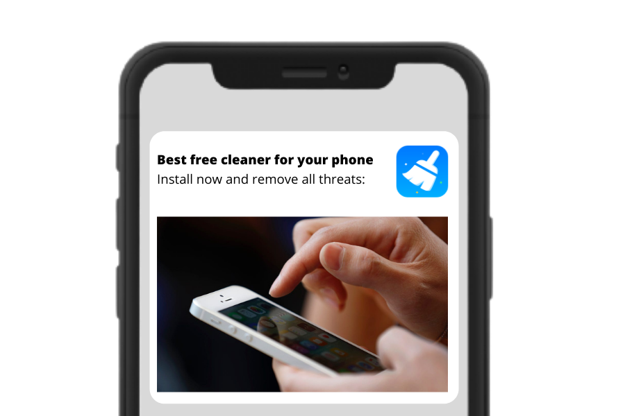
Take a look at average push notification structure:

This is a simple example of a creative that can be used. What makes creatives so special
anyway?
Is it really just a picture and text?
Let’s dig into it and find out how to choose the best ones to boost your campaign’s
performance.
CREATIVES SUCCESS POINTS
The main purpose of a creative is to attract users with interesting content and make them
engage
with your offer. Creatives should be relevant to certain offers and match their targeting
(geo,
language etc).
Make sure to check a few points before starting testing your creatives.

Good-converting creative’s should contain:
- High quality pictures/GIFs. No matter how great your visual design or idea was,
it
will get
spoiled by low quality pics. Pay attention to the size of the picture should match the
length x width requirements on Adavice DSP and device targeting.
- Short and catchy text. Don’t use long, boring phrases, try to be entertaining.
Make
sure you
give valuable and interesting information about your offer.
- No misleading information. Info of the creative should be relevant to the
promoted
offer.
Otherwise users will leave your landing page as soon as they see that it is another
offer.
- Understandable call to action. For example “Register”, “Claim”, “Receive a call”
etc.
Depending on your campaign goal - use an appropriate call to action text.
- Use a personal approach. Successful stories, icons that are associated with
message
notifications we get every day or product logos will help to gain trust in the promoted
products.
- Use current trends. Thanks to social media there are new info blasts almost every
day. Stay tuned in terms of current trends, use such hot topics to stay on the top.
- Text and pics showing a clear benefit for the user. User has to be interested in
order to complete your target action. Make sure you show him benefits on your creatives
(examples: getting money / prizes / bonuses/ discounts, saving time, simplifying work
process etc).
- Use of numbers. Numbers are cathy and they can trigger positive emotion or
desire.
For example “get money / bonus” is good but it is still not clear what exactly the user
can
gain. If you say instead “get $1000 daily / get 300 free spins / 75% sale” it will show
the
user what the opportunities are, and when clicking on the ad he will be more interested
in
pursuing the stated goal.
Make sure that creatives you are using correspond with Adavice DSP Content Policy
Note : creatives should not contain prohibited
or dangerous content. Adavice DSP follows a worldwide accepted Content Policy and cares
about
the user experience to provide best-quality traffic.
TIPS FOR CERTAIN VERTICALS
Luckily, over the years marketing professionals have been collecting and sharing their
experience
in many
verticals. Each one has a variety
of
creatives’ options and converting trends on the table.
Here are some tips for the most popular verticals!
Finance
- Text: easy profit solutions. Try to make emphasis on time terms of financial
offering, money benefits and speed of solution;
- Pictures: use pictures of money (with relevant currency), logos of financial
institutions or national symbols (flags or colors).
- Tip: check what is currently relevant for your Geo.
For example: trading gold would work better for East countries, when Crypto or Shares
would
work better for Western countries.

IGambling / Betting
- Text: add bonuses info to attract user, use emojis
- Pictures: use sport, e-sport related pictures (sportmen, equipment, arenas etc),
use
relevant flags, promos when promoting certain sport events/matches

Gambling / Betting
- Text: add time urgency (ex. Limited offer, exclusive deal), attract with
successful
stories & bonuses (“N won 350$”)
- Pictures: use simple images & icons, use pictures with real people

Sweepstakes
- Text: mention the prizes, competitions, their time frames and bonuses received;
- Pictures: use the pics with wheel of fortune and gift images;

Tools / Utilities
- Text: don’t use scary statements (ex. “Your device is in danger”, “You have N
viruses”, try to promote the advantages of your product)
- Pictures: use the pics with wheel of fortune and gift images;

Nutra
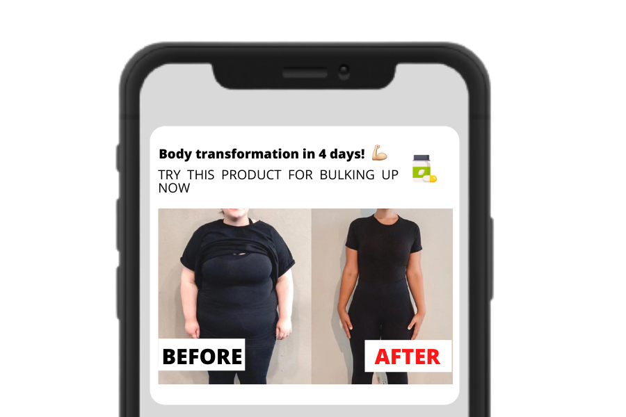
- Text: add appealing benefits & positive reviews of a product/program, add emojis
- Pictures: use pictures related to your product/service (program promo,
supplements
etc) &
health related materials (statistics & visual results)

Find more related information in the Verticals Guide.
Don’t hesitate to ask your manager if you didn’t find the info on a certain vertical ;)
AD FORMAT SPECIFICATIONS
As we’ve covered verticals, let's talk about different ad formats.
They obviously need different approaches when it comes to choosing creatives - from image
size
to promo texts. Here are some suggestions you would probably like to test out :)
Popunders
- Popunder ad’s creative is the offer itself, as user sees it behind or before his/her
opened
web tab;
- The offer should contain all info on promotion, shouldn’t contain fake promises;
- Add clear Call to Action: 1 or 2 buttons maximum not to confuse user;
- Make a Landing page bright and interesting, it should catch the user's attention in the
first few seconds.
Push notifications
- Make a push personal: know your target audience and what they want;
- Catchy and bright promo pic is a must, attract with your product/offer;
- Use simple icons. You can use product logos, similar messenger / notifications icons /
or
clear icons related to the offer topic;
- Pro tip: as inpage push needs an icon only, it is important to choose the right one.
Test
different ones at the same time!
Native ads
- Attract with text: use interest triggering texts (ex. “Did you know...?”, “Have you ever
tried…?”);
- Use statistics and numbers as a compelling information;
- Big banner is very important: make it emotional and understandable.
Display
- Promo text: make your message short and CTA clear, use bold font or bright colors to
attract
user’s attention to the important info.
- Banner picture: use on-brand images
- In display ads, web or in-app, text and picture work as one (so, keep one design!)
Calendar notification
- Text: strategies for previous ad formats can be used, remember that user sees
your
promo in phone’s calendar, which limits the number of characters available
IT’S TIME TO TEST AND OPTIMIZE!
Great, you’ve selected the creatives specifically for your offer, vertical and ad format. Now
it
is time to let users see them!
Don’t forget the main key points when testing:
- Add at least 5-6 creatives per campaign;
- Perform A/B testing: change icon, image or text to test more options at once and
leave the most converting creative (ps. Change only one parameter at a time for the
accuracy
of test;
- Freshen them up: creatives’ performance can drop from time to time, so make sure
you’re adding new ones to increase Click Through Rate.
Every offer and case is unique. Be free to test multiple ideas and create your own working
model.
Mix and match the pictures, texts and promos to make the ultimate creatives specifically for
your promotion!
Share your inspiring creative solutions with us (support@adavice.com)
and get a bonus from our team!
Stay ambitious and good luck ;)
